Really excited to announce my first solo exhibition for Geometric Los Angeles - A Architectural Photography Series. Coming up in September 2, 2017 at the Nous Tous Gallery in Chinatown, Los Angeles.
-
Come & say hi.
Invite your friends.
Enjoy the show.
-
form. Design Magazine
A couple of my pics were used for form. Design Magazine's Danger issue including the front cover. Go check out this really well designed magazine from Germany.
New Art Direction Work
A new editorial project with Lauren Naylor & WHIT by Whitney Pozga is now up. Really excited with how this shoot came out & the combo of architecture & shadow play used. More of it HERE.
Downtown LA Takeover
If your in Downtown Los Angeles go check some of my work via StandardVision on the corner of West Olympic Blvd. & Francisco St. Thanks again to Sinziana Velicescu for putting this all together!
Fast Company + Fast Co. Design Interview
A new interview of mine went up via Fast Company + Fast Co. Design on the pastel trend & how it reflects the current times of unrest. Enjoy guys, this article really digs deep into the psychology of color & what it has looked like in the past. http://bit.ly/2cEPhG4
Sand & Such Interview
My interview went up for Verena Michelitsch's project about creatives & their snoozing habits, morning rituals & overall slumper. Described as "exploring the aesthetic of sleep in a visual way." Go check it out to read more here.
NYC Shoot Selects
A few selects from a quick shoot in NYC at the World Trade Center Memorial & Roosevelt Island. Model: Orlando Asson.
S H A P E S Furniture Collection
New art direction work is up from a recent shoot for woodworker, Emma Holland Denvir's furniture line to be featured on Sight Unseen.
Design Milk + Sallie Harrison Design Studio
Some pretty rad wallpapers I made for Design Milk's April Designer Desktop series are up today. Complete with one of my favorite Massimo Vignelli quotes.
" If you do it right it will last forever."
Multiple sizes for your desktop / iPhone / iPad are all available on Design Milk's site here: http://design-milk.com/desktop-wallpaper-april-2016/
Melted Holographic Images + How To
Lately I've been really intrigued with dripping / melted holographic textures. So I finally decided to make my own & I'm really excited with the end results.
Here is a quick walk through for you to try it yourself.
- Get some holographic paper at your local art supply store or online here.
- Then photograph or scan the paper. I photographed mine outside with natural light since the colors change depending on the sunlight & angles.
- Then take the images into Photoshop to manipulate them & add the melted texture. I recommend using the Liquify tool for the specific melted look.
Final shots below. Hope you enjoy & take a stab at it yourself!
SHOP SALE
All the goods in my Shop are on sale this weekend starting today 2.18! Go check it out.
PANTONE Colors of 2016 | Geometric LA
PANTONE released their colors of 2016 (Rose Quartz / Pale Pink + Serenity / Light Blue). And to top it all off PANTONE shared my Geometric LA series in all it's pastel goodness! Bring on all the pastels 2016, I'm ready!
On The Grid | Griffith Park
My guide for Griffith Park, Los Angeles is live today via On The Grid's site! I'm beyond excited to be a part of On The Grid's neighborhood guide which includes neighborhoods & cities all over the world. Check out the full guide & see what hidden gems I included!
iGNANT Magazine Feature
Shout out to the guys at iGnant Magazine for featuring my Geometric LA series today on their site. Thanks for all the love guys! Read the full review here.
Totally Savage Show
You are all officially invited to a collaborative art show that I'm joining by my friends Twin Beast at the Co-Lab Gallery Friday Nov. 13th in Highland Park, Los Angeles. There will be a couple of my architectural photography pieces from the series Geometric LA as well as lots of art, patches & just plain cool stuff.
Reception starts at 7pm. Come by & say hi!
Poster done by the very talented folks of Twin Beast.
Top 3 Online Website Builders
I've recently had quite a few people ask about the best online website builders around right now for portfolios & e-commerce sites that are easy to use as well as beautifully designed. So here is a round-up of my top 3 to give you a better idea of what platform you should look into.
Key guide:
+ = Positive features
- = Negatives
1. SquareSpace
+ Clean, well designed site templates with a very user friendly navigation. You don't have to be a graphic designer to get a well designed website.
+ Huge bonus is that they have various templates for portfolio's, businesses & even a e-commerce feature that lets you sell digital downloadable products as well as physical goods.
- If you want a combination e-commerce & portfolio site there are only 1-2 options that available but can be adapted with a bit of elbow grease & getting into the developer platform.
2. Cargo Collective
+ Free template options & hosting as long as you have only 12 projects & keep below a certain number of memory space & access to your sites CSS.
+ You can upgrade & get more template options, HTML & the backend are now available & more projects / space is available.
- No e-commerce options. You would have to use another site to refer to.
- You have to be accepted / email them to sign up & show some of your work or have a friend refer you.
Good News: It's not very difficult to get in though.
3. Wordpress
+ Lots of template options to choose from or you can easily develop your own.
+ E-commerce, Portfolio's & Blog options are all avaliable
+ If you are super picky & have a very clear idea of what you want your site to look like your best bet is to go with Wordpress
+ - Wordpress gives you more freedom but requires more coding (that's why this one is a positive & negative point). If your comfortable coding or can put in the time to learn then Wordpress is your best bet.
Hope that helps & gives you a good starting point with your next site!
Also in case your wondering here are the computer models used in my illustration, bc science!
Left: Osborne 1 Model 1981 | Middle: CDC Graphic's Terminal 1970's | Right: Wang Computer 1973
| Surrealist Storage |
A couple photos of a study in architecture that took on a eerily beautiful Surrealist quality. More here on VSCO. | Frogtown, Los Angeles |
5 Ways to Improve Your Brand on Instagram
With Instagram opening new doors & expanding networks, it is more important than ever to have a strong unified brand. One that within 3 seconds of looking at (the average time someone will look at your page before moving on) will keep their attention & even initiate interaction down the road. Here are some tips to take your personal brand to the next level that I've learned through a bit of trial & error.
1. Study other successful feeds & learn from them. The more you look & study what others are doing right the more you will learn & eventually soak in simultaneously. It goes back to the saying "Who you surround yourself with is eventually who you will become." So look at as many good examples as you can & don't be to hard on yourself. You'll get there with a bit of sweat & elbow grease.
2. Develop your style & tastes through other avenues. Whether that be through Pinterest, Tumblr, or even magazine clippings. Have a designated site or folder to keep lots of examples of images you love & want to recreate. Somewhere you can go for inspiration. In the past I've used a photo collection program called Ember for this as well as the site Designspiration & go there regularly when I hit a creative block.
3. Make your content unified so they all flow together & have an underlying theme. People respond positively to order & pattern. Whether it be in color, content, or style of image. All of the best social media guru's have a theme that works for them & they stick to it. Work hard to find yours, one that is also natural to you. It doesn't have to be perfect or have professional photographed pics but people do know the difference between a thoughtful image vs. a quick pic.
4. Look at your content as a whole. The last 3-9 posts are what most people will see when they look at your page & then decide to follow you. Make them count. Sometimes it helps to lay out the next couple images in a separate album folder or program. You get the idea. You may think that this is just an unnecessary time consuming task but I promise it gets easier once you get the hang of it & you will have good results down the road.
5. Leave thoughtful comments on other's posts that initiate conversation. Everyone wants to feel connected & make new friendships on Instagram. The surest way to gain a person on Instagram is to take the time to get to know them first. Be consistent & leave comments that are genuine & longer than the typical one word or my very favorite, emoji only/no words needed comment. There are times & places for those types of things, once you've already built a foundation. And also, there is no shame in following them first. Just do it & have the confidence that they will return the favor down the road.
Here are a couple really fantastically themed feeds/brands/styles for inspiration.
Instagram: ThisWildIdea, Circa Doughnuts, TuesdayBassen, Maritime Supply Co, Elise Mesner, David Kitz
Minimal Zine Instagram Takeover
So I'll be taking over Minimal Zine's Instagram for the week. It's going to be all architecture & geometric shots with a new color theme each day. Take a look & follow along because it's going to be pretty rad!
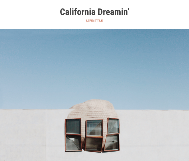
California Dreamin' - Guest Post for The Explorationists
So earlier this month I wrote a guest post for my friends The Explorationists about moving to LA, starting over & facing your fears. This was the first time I took a shot at writing, usually I prefer to just have the visuals speak for themselves, but the whole process was really satisfying. Not to mention the great feedback! So I hope you enjoy it & feel free to tell me what you think.


